
I can see why James Jean abandoned comics for painting. That probably sounds cruel. I mean, I love Batgirl and would have been in heaven if Jean had done some interior work, but comics are just too small and insular a world for someone of Jean's talent. He deserves the more sophisticated audience he's found.
But for a short time we were lucky to have his work gracing the cover of our favorite DC comic magazine. If it's a toss-up between Damion Scott and Rick Leonardi as my favorite interior artists on this title, Jean is hands-down my favorite cover artist. No, you know what? I may have said otherwise just a post or two ago, but after rediscovering this, I'm going to have to declare Jean my new #1 Cass artist. Not having him do a full fledged story was a huge mistake on DC's part.
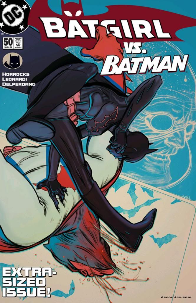
Jean's Cass is another example of how none of DC's artists ever drew her costume the same way. Jean gives the material a thickness similar to Brian Bolland's take, but with a shinier, more leather-like finish. It's not as glossy as the BDSM-style wet look Scott gives her, though. Jean also renders her boots as separate pieces, rather than part of the body suit as so many other artists do (although the gloves appear to be part of the sleeves). She probably needs some kind of combat treads on those soles, but that's a minor quirk. Notice, too, the subdued Bat-symbol and the little touches like the seams around her wrists and down her sides. Jean definitely has her in a costume as opposed to the "painted nude person" look you sometimes find in superhero comics.
This is a strong image, representing the plot (I'd say it's symbolic, but Batgirl and Batman actually fight like this), with the inventor of the drug that sets them at odds floating behind as a ghostly, disembodied head. It's a highly graphic design, with great silhouetting of the figures-- if they were totally blacked in, you'd still know what was happening and to whom-- and a feel for movement and impact. Loads of appeal, dynamism, superior color sense all combine to make this my absolute favorite Cass Cain image, bar none, and the single best cover image of the entire series.
Also, I love when Cass puts some whup-ass on other members of the Bat-family. Batman definitely deserves it.
DC's graphic designers mucked this up, though. The text is way too heavy and too close to the figures. Totally unnecessary and really busies things. It crowds the top right of the composition and pulls the eyes there, makes you not stare enough at the nice line of action and complementary poses Jean worked out. We can look at the painting and know Cass and Batman are fighting, we don't need some copy editor butting in like a hyper-ventilating pro wrestling announcer. This would have been much better copy-less.
This cover is awesome.
ReplyDeleteYes, it is! All of his covers are fantastic, but this is the stand-out. Probably because I like seeing Batman get kicked in the face.
Delete